Kathy and I became instant friends in a mastermind group at the beginning of last year and ever since then, I had the vision for this shoot brewing in my mind. She’s a stellar copywriter and has poured her heart and genius into a brand that creates a place where clients can come, slow down, and rekindle the passion they have for their own business and channel it into powerful copy that forges deep connections with their target clients. Thus the business name, Rekindle Communications.
We’d talked over countless Voxer threads about how her visual brand had started to feel a bit stale following a great calendar year of growth. And naturally, the topic of refreshed brand portraits came up. She’d had a suite of photos before, but as is with all content-creating business owners, we use them and repeat usage often. The best response to her itch to throw caution to the wind and redo it all was to schedule a half day shoot and create imagery that mirrored the growth and positioning she’d gained since the last time she’d stepped in front of the camera.
We then coordinated our schedules to be in Phoenix around the same time, found an Airbnb that entirely aligned with her brand vibe, and set this shoot in motion.
On her pre-shoot call, we were discussing some of the nuances of her brand and how to portray it all visually. Her messaging is super honed in and she knows exactly how she wants to be perceived in her spot in the market – but that wasn’t entirely translating visually in a way that felt just as iconic as her messaging.
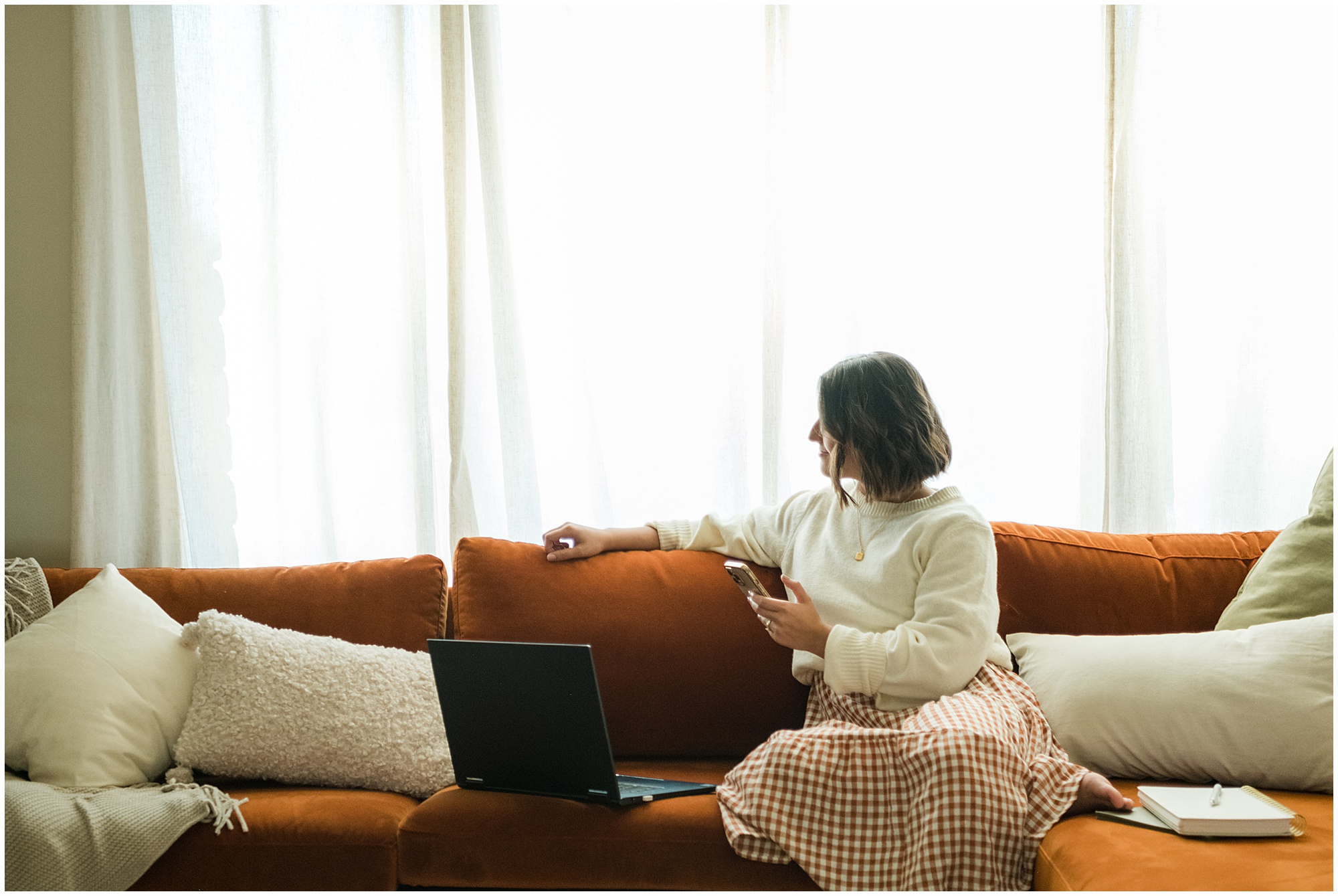
She gravitates towards all the slow-life, hygge vibes. Think almost Little House on the Prarie meets idyllic, cozy cabin vibes. The irony is, she actually lives in Orlando. So the dilemma lay most in balancing her actual geographic location with a blend of all the cozy vibes, allowing them to exist simultaneously and not feel off-kilter.
After noticing that in my own research and hearing her own description, I made the statement: “I feel like your brand is like that transition period between summer and fall.”
Then digressed to describe what I meant – it’s a flickering candle instead of a roaring fire. A lightweight sweater thrown over a sun dress instead of chunky cable-knit and wool socks. It’s more dawn light and bright like summertime but balanced out with some deeper shadows that feel a little moodier than what we usually think of in summertime.
This dichotomy is where the most distinction lies in her visual brand.
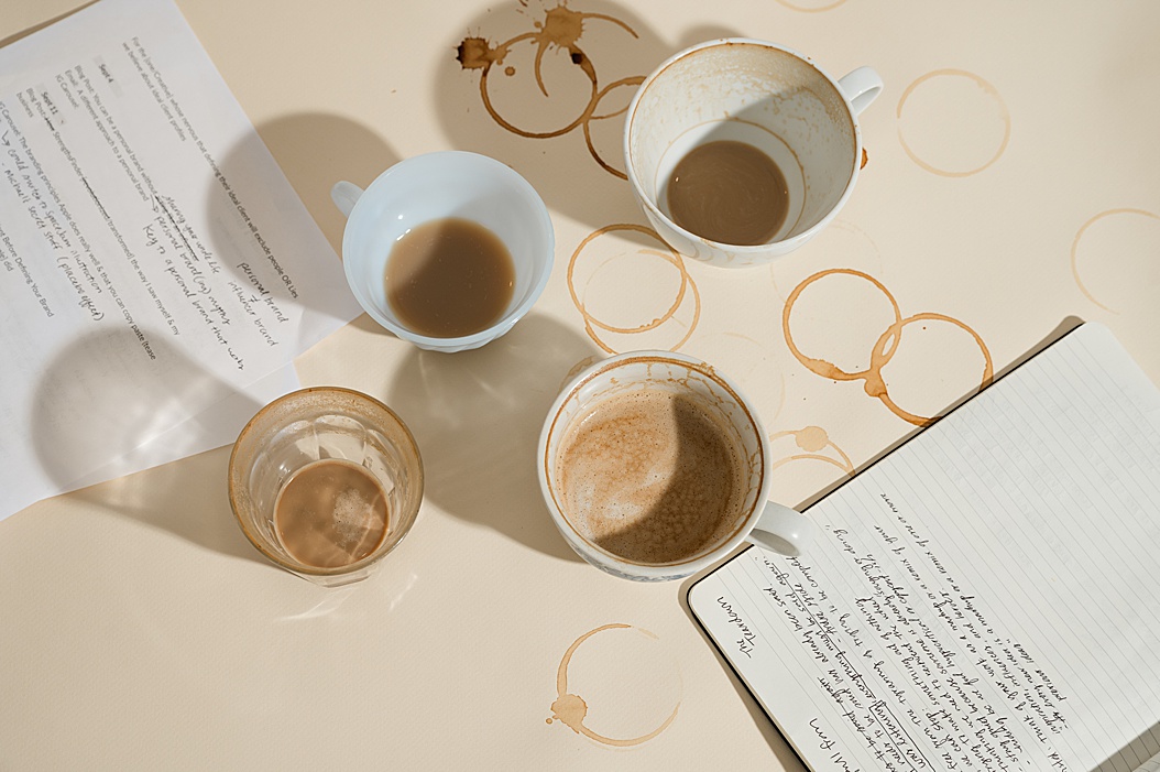
Another fact about her as a writer is that she’s not the stereotypical writer/reader combo. So having her nose stuck in a book for various photos or a ton of book-stock didn’t quite make sense. She is a journaler though and loves poetry. Rather than having her pack tons of books to ensure her suitcase would be over that 50lb limit, we ran to Target and grabbed notebook after notebook to give her paper-stock and layers that show her commitment to focused, intentional writing and time-blocking to create whitespace in her calendar to live a life outside the four walls of her business.
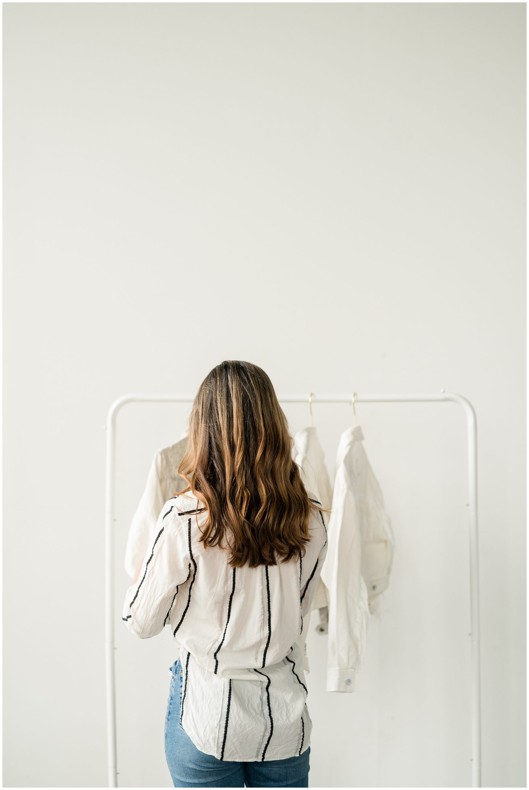
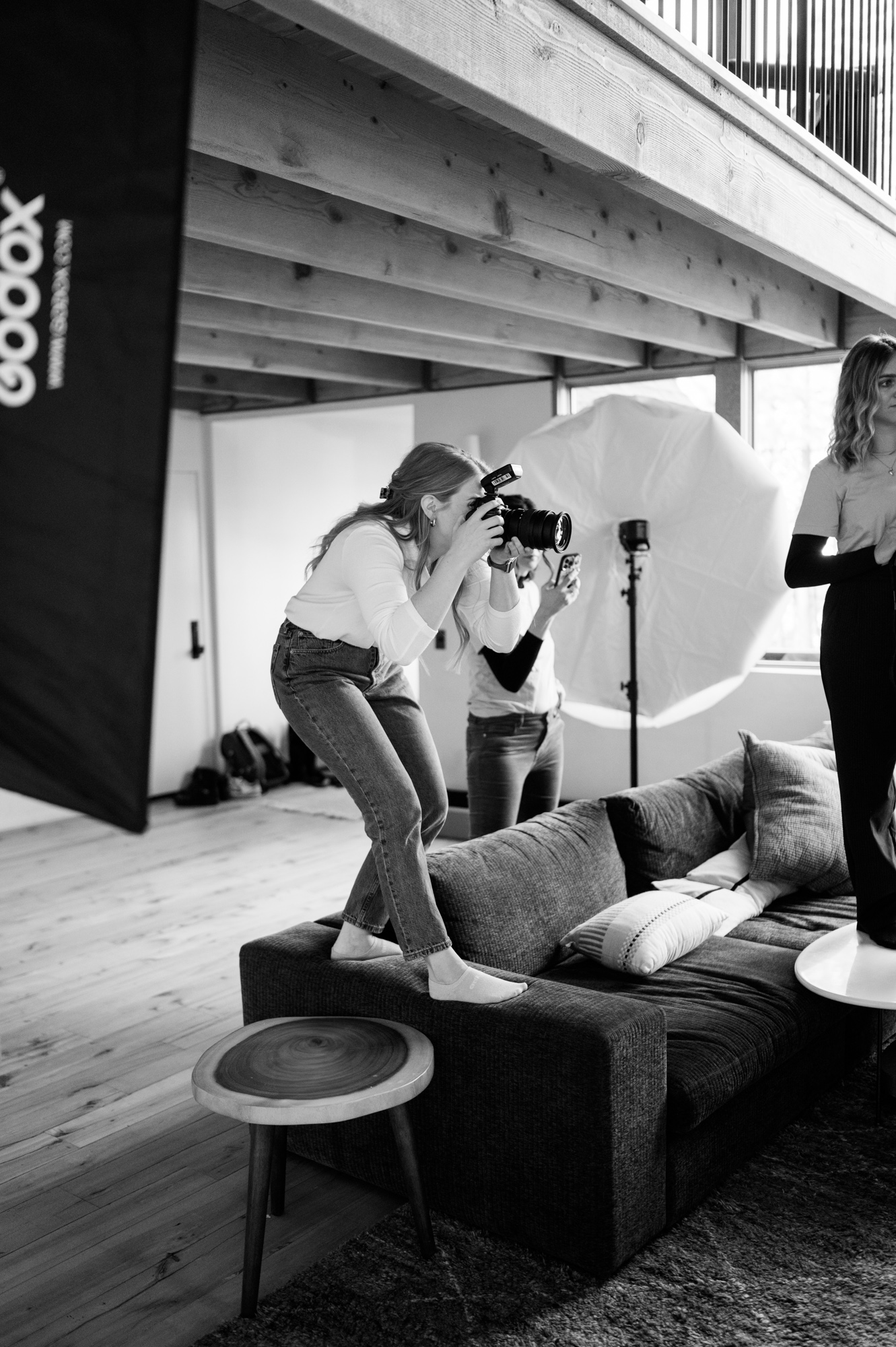
Those conversations set the stage for her wardrobe styling, prop inclusions, background decor – the lot. And between those layers and my shot list designed to fill her website, lead magnets emails, and blog content – we set to work, played with light, and created photographs that feel custom to her and all that she’s created.
If you want to see her brand photos out in the wild and at work in her business, feel free to peruse her website and social feeds.



Comments +