


The journey to feeling better can take many avenues. At Clem & Thyme Nutrition, that way looks like feeling better through simple changes and simple choices around food.
This shoot was our second round together, which meant we could skip the getting-to-know-you part and get right to work.
Leslie and I jumped on a call before selecting a shoot day and talked through what had shifted since round one and what this next set of photos needed to support—especially with a stunning new brand kit to work with and a team that’s often in flex.
By the time her pre-shoot call rolled around, I was bursting with ideas and concepts from my research. As we talked creative direction, I kept coming back to color.
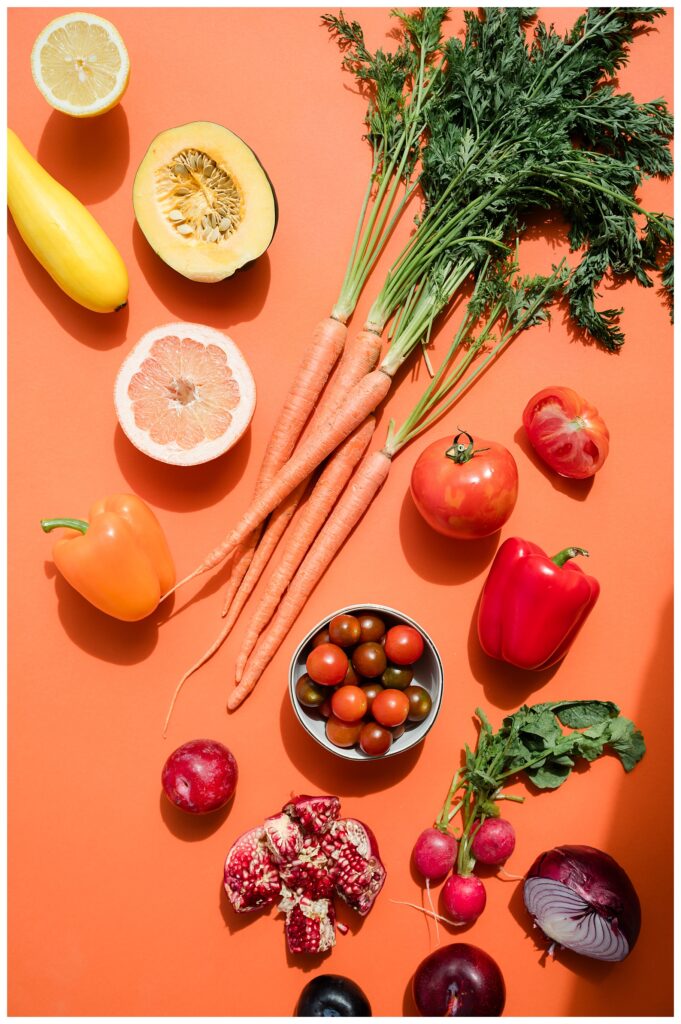
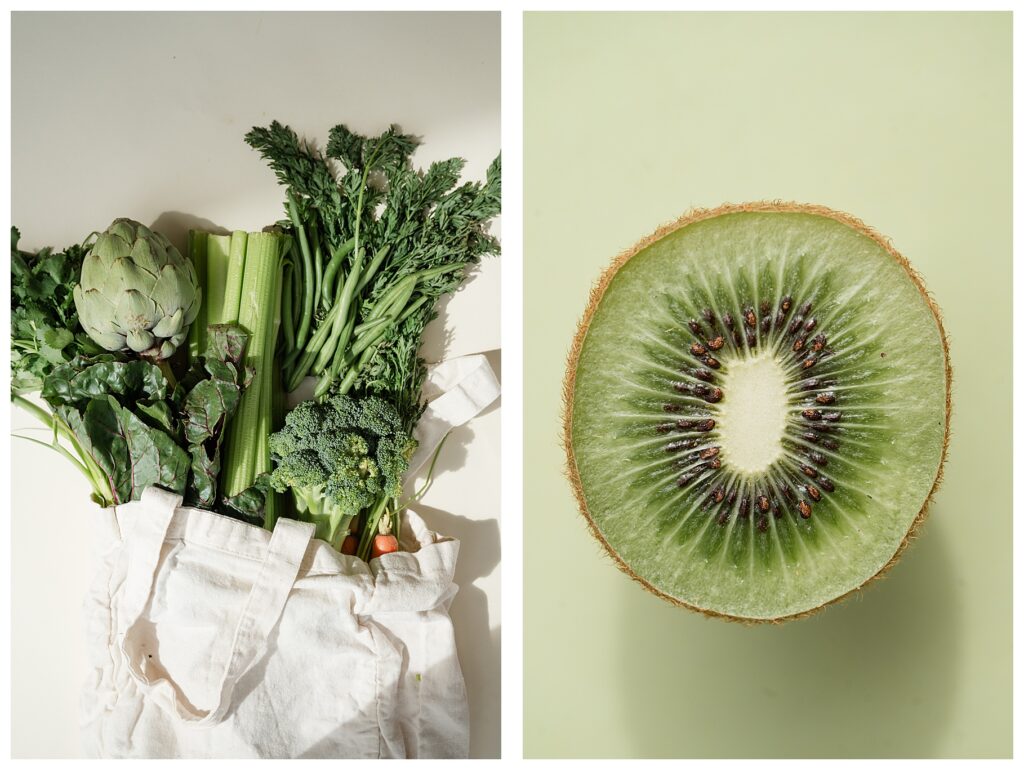
Their brand colors in the new kit are a play on their name, with oranges, greens, peachy tones, and lots of brightness. Which immediately made me think of the vibrancy that naturally comes from holistic practices around food.
So, I proposed a big idea on our pre-shoot call.
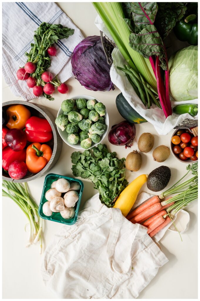
What if we created a set of monochromatic stock imagery—flat lays of food that matched the range of their brand colors and communicated the vibrancy of life that can come from nutrition?
She, very graciously, said yes.
And we left the call with our own tasks. Hers was sourcing food that fit their brand palette. Mine was tracking down paper backdrops to match.
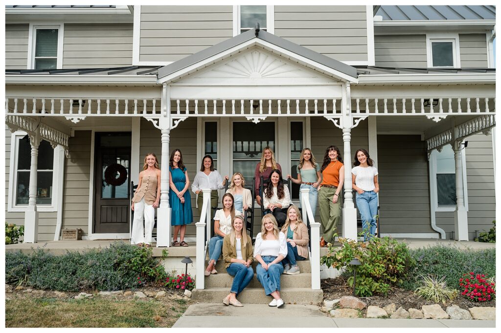
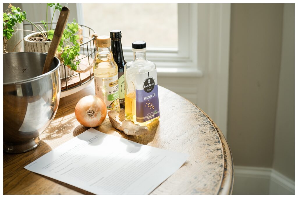
The first shoot for Clem & Thyme leaned heavily into the welcoming, farmhouse feel that fits both their brand and the literal farmhouse they work out of in Dayton, OH. This time around, the goal was mostly the same, just with a different edge—one that came through those bold new stock images.
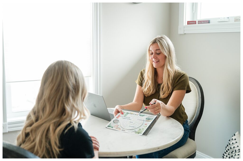
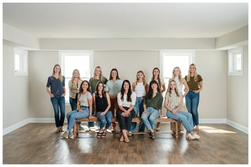
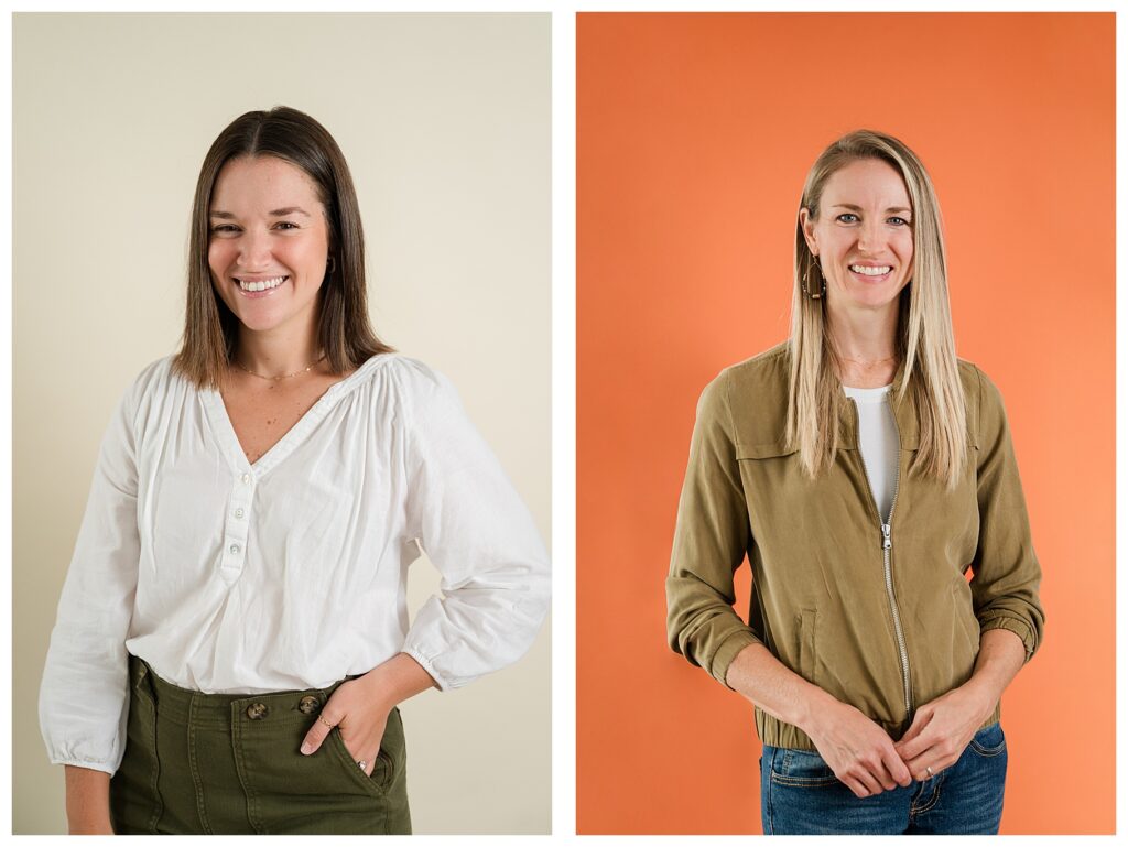
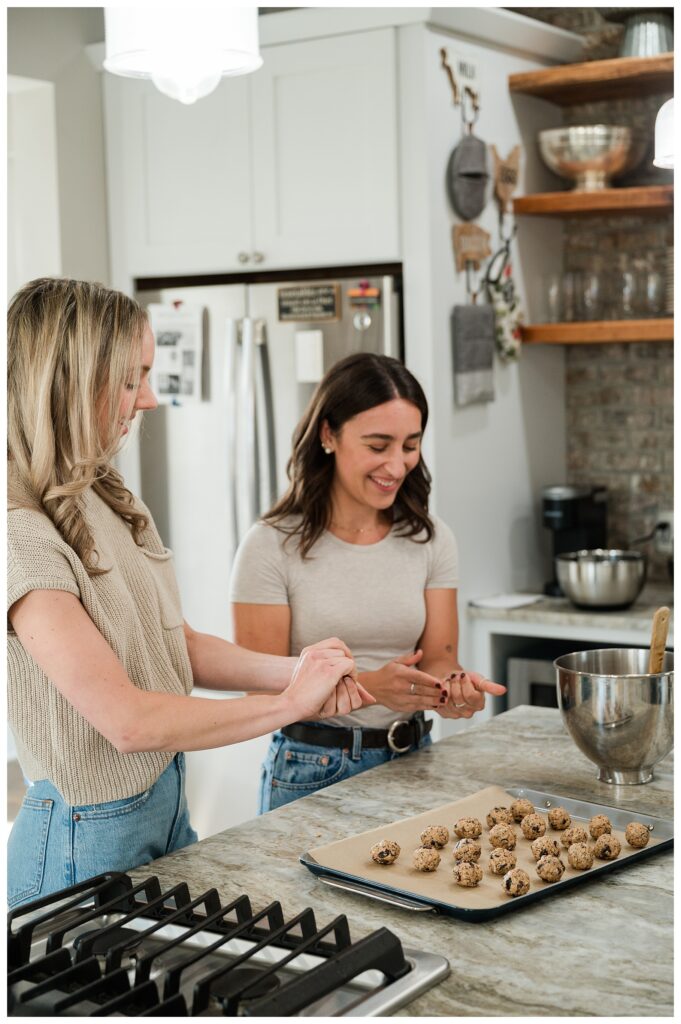
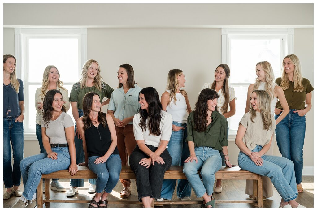
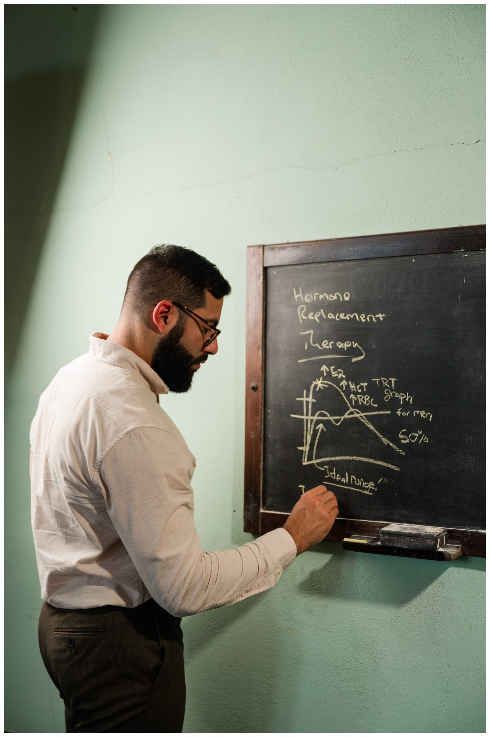
We also pulled photo gap notes directly from the team, which helped narrow our focus pretty quickly. They needed more imagery of their work actually happening—dietitians in conversation, guiding clients, teaching around food—and updated photos of the people and spaces that reflect how they show up for clients every day.
The result is a refreshed library that adds some much-needed diversity and fun, while continuing to remind their people that nutrition isn’t about boring diets and limitations. It’s about simple changes and simple choices that help you feel better and bring a little more zest back into everyday life.
You’ll see these images woven throughout their socials, layered into resources and graphics, and living wherever Clem & Thyme Nutrition shows up next.




















Comments +